I think they are completely and utterly useless. Investing in a company should be viewed like buying the entire enterprise, not based off short-term ‘indicators’. Don’t think they add value, and they provide unnecessary ‘noise’ for new and existing investors.
3 Likes
The do work on longer timescales, it’s not just a short term indicator and you can see at a glance if the company went up or down in the last day/week/month or whatever timescale you are looking at. I don’t see that as useless or unnecessary noise
1 Like
Doesn’t their normal graph show that anyway? If you look at the general trend it gives you as good an idea as the candlestick would for long term investing, without all the extra noise
1 Like
I agree with this, these are not useful for investment and therefore should not be a focus. To my mind the existing graphs are already too biased toward short term moves in price (days/weeks) and need to move more toward a long term view.
As Freetrade offers very low cost trading there will always be pressure from people who want to use it to trade over days or weeks, but while it’s fine if people want to use the platform for that, Freetrade should resist catering to that market if you see your core value as long term investing - the more features added for short term trading, the farther Freetrade strays from that mission of opening up long term investment to everyone.
Also once a feature is added it has to be supported forever (dev costs, cops costs), so there is a significant cost beyond just the time for the initial work.
3 Likes
I don’t see it as noise, if the price went up yesterday it’s a green bar, if it went down it’s a red bar. I see that as simple to read information.
4 Likes
It does, but without showing all the information. Day one stock opens at £100 and closes at £101. Day two it opens at £101 and closes at £102. A normal graph would show circa 1% growth per day (exagerated figures).
If a candlestick for the same company would show a fluctuation from £100 to £80 then back to £101 on day one and from £101 to £120 and then back to £102 on day two, that is a completely different perspective. For example, there may be people who do not like volatile companies in their portfolio and a candlestick will be a perfect solution to show that.
5 Likes
If you are looking for risk and volatility on stocks you should be looking at metrics such as beta, rather than short-term market volatility over a 2-day term.
1 Like
2-day term was indicative, it could have been weekly/monthly/quarterly looking at a few years back. Beta is another option but if you want a quick glance - candlesticks are still useful.
Don’t get me wrong, I am not saying they are essential, but they can bring value to some without hurting the rest. If it was a hidden feature in setting which could be turned on by those who need it - that would have worked well in my opinion, without unnecessary complications for those who are not interested ![]()
8 Likes
Any chance our recent conversation can be merged at the end, it almost looks like it’s been purposely hidden by sandwiching it somewhere in 2018 so nobody reads it. ![]()
Hey Phil, I’ll take a look — and that definitely wasn’t the intention.
There were three threads on Candlesticks, and I wanted to merge them all onto the most relevant thread. The order it embeds them seems kind of random, or by date, so there may be no other way.
2 Likes
I know you guys are super swamped but is there anything in the works for having the options of candles, I get not everyone wants them and everyone has an opinion of them but to me that suggests to me they would be a good addition. Any extra option of how you view your portfolio is better.
1 Like
The lack of option to turn on technical charts is a definite drawback. Even for mid to long term investments I want to pick the best entry and exit points. I understand you want to focus on investors rather than traders but if that’s the case, where is the fundamentals for each stock? Ratios, earnings etc… Data we can use to make educated decisions. I currently have to use external charts and data sources for everything while you competitors include it. I’d pay a premium for it, I already do for real time LSE charts.
2 Likes
Good day,
I gave the other topics a read and wanted to post this as well.
1.Is the graphic to be done with candlesticks in the works? Like a few months or a year?
2.the time frame on the graphic is also a needful information.
3.Are you guys planning to make fractional ETF?
Only because of Eqqq or other which are 500 pounds per share. Thank you
There are other topics about these requests you should read. UK fractionals was mentioned in the Zoom chat as on the roadmap but they were essentially building their own product that could potentially be another revenue stream (exciting but might take time).
@AdamL
Yes but maybe due to popular demand they may be at some point Implementated.
They can be done over weeks or months to see the overall trend, so if you plan to do a 2-3 years investment the candlesticks are very very useful.
1 Like
Oh I agree, I’d like candles etc and all the bells and whistles, click on the graph to expand so that people aren’t overwhelmed I guess. Need live prices first or its sort of pointless.
2 Likes
![]() @AdamL
@AdamL
Yes I go on investing. Com to get the live price, but it’s cheaper here anyway than using vanguard themselves or any other platform.
The only thing with just etf or HL and the rest you need as well to go to 3rd part apps to be able to see the candles.
I read 2 books on the matter.
The line does not capture the candle that shoots up or goes down.
Like u said if u are long term you are not bothered but if you can see them you may just want to buy now or hold off if the correction keeps going the line does not tell such a story.
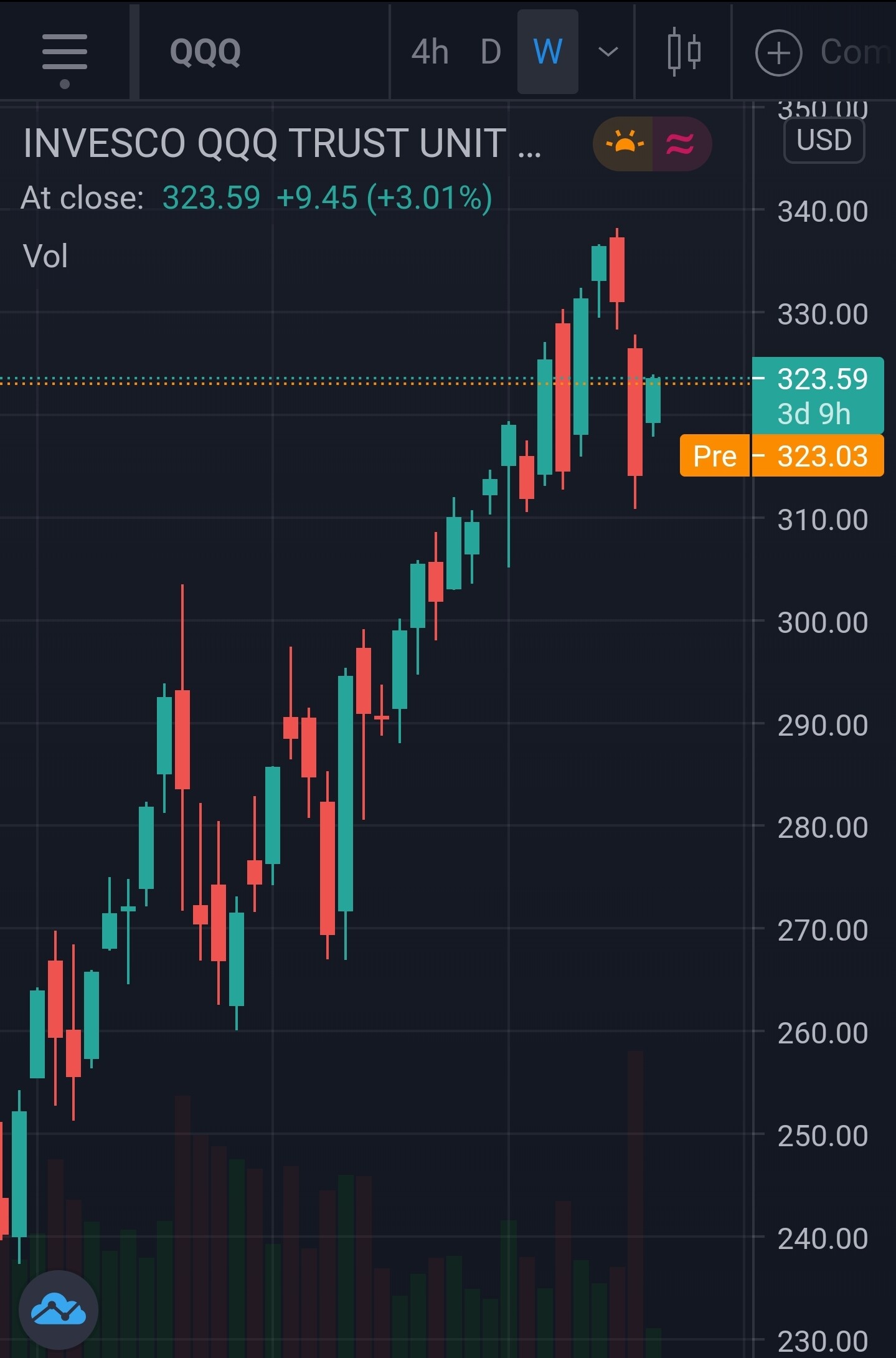
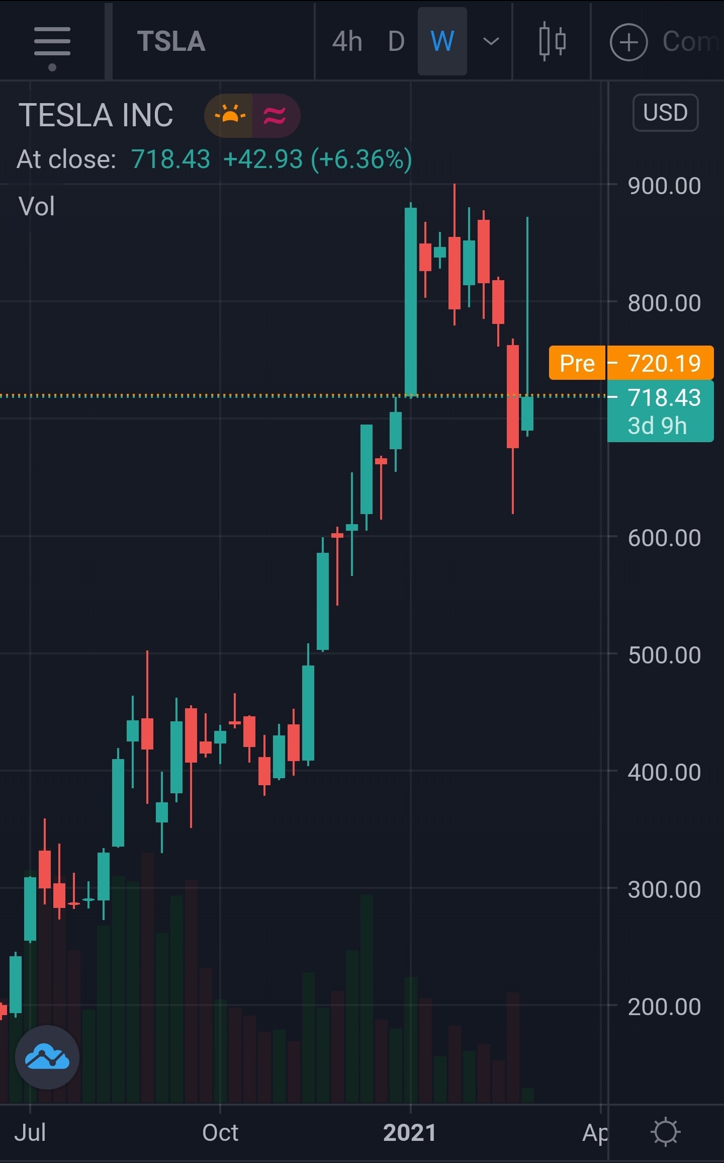
Or take a look at this the line will not tell the story, you have 3 black crowes on a weekly basis and then a candle shooting right up.
This is a medium reversal pattern, it reads like a book.
You can also see that it went and the 800 was the resistence.
So it can continue to slide due to several factors or it can potentially test the resistenxe at 800 again if it bets the resistenxe path to 1000 can be open, if not then the mini downtrend can continue.
No one can predict the market but the candles do offer insight, and you can adjust your strategy accordingly.
I can justify it the other way around as well as above but all I am. Saying is candels are nice!
This is from google:
The three black crows candlestick pattern is considered a relatively reliable bearish reversal pattern. Consisting of three consecutive bearish candles at the end of a bullish trend, the three black crows signals a shift of control from the bulls to the bears.19 Oct 2020
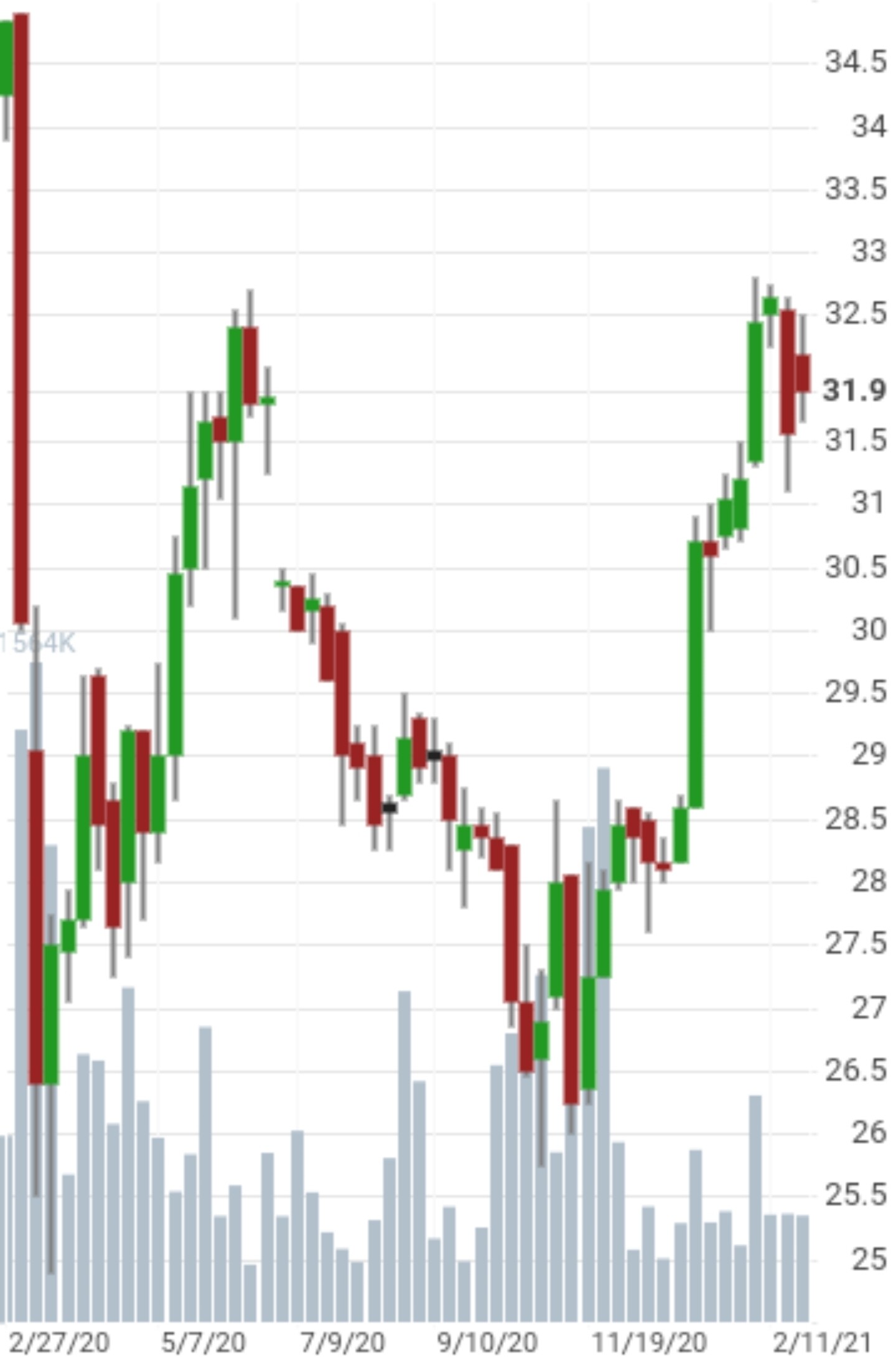
Or this one I bought some at 28 and sold at 32.
There is trouble but the rally can carry on but I was happy with my gain and exited the rally.
Everyone had their own strategy but the candles do help.
2 Likes
I trade frequently and looking for decision makings with candlesticks chart info with reasonable cost. Any suggestions are welcome.
1 Like
Investing.com and TradingView (iOS app, not sure if it’s also on google) are both free and useful.
TradingView screenshot attached, with a bit of luck