So whos copying who?
2 Likes

It’s just the Adidas logo turned on it side and a different colour.
3 Likes
Mmm very similar. I wonder what Freetrade have to say about this???
I don’t see an issue they are different??
2 Likes
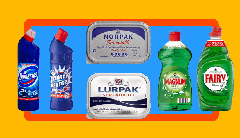
To be fair if I want to clean a toilet
Power force
Does sound more enticing
4 Likes
I don’t understand how supermarkets can blatantly copy the labelling, unless the product is actually made by the company who makes the original version.
I’m sure they have a large team of people ensuring it is juuuuuuuuuuust different enough to not cross any legal lines.
2 Likes
Hmm I’m curious what the FT logo would mean. Does anyone know?
It’s an F
4 Likes
It’s the furrowed brow/wrinkled forehead of the product managers at rubbish dealing services like AJ Bell who are puzzled and frustrated that Freetrade would come along and ruin their great hustle of charging £9.99 for every buy and for every sell…
They don’t understand why Freetrade couldn’t play along and just enjoy the massive margins.
13 Likes
creative ![]()
![]()
Make sense ![]()
Who was the artist that designed the logo and decided on the colour pink???
The Freetrade logo was designed by us at koto.studio. Many things look alike out there, especially the simple ones. The original meaning was something that felt flag like, denoting the revolution Freetrade brings to the market. We intended it to sit happily on the users phone amongst other great apps like Airbnb, Spotify and Netflix. We chose pink to stand out in a world of boring blue.
28 Likes
Thanks for the reply. Its a great design, suits a young audience and the logo can speak for itself. I love it!!! ![]()

1 Like
But it’s just a bunch of squiggly lines?
2 Likes
Only to the untrained eye, same could be said about your name ![]()
3 Likes
I’m not sure I agree they’ve copied FreeTrade. Apart from an F at an angle, it’s not that similar. I’m also more skeptical when it’s a company who don’t value good design, but clearly here they do with a beautiful website and high standard aesthetics throughout all of their marketing. Their quality and attention to detail is definitely there. It just doesn’t stink of the laziness of usual plagiarism.