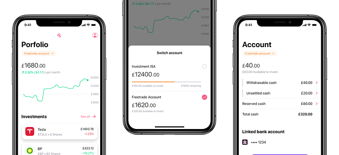
Yesterday I shared a little sneak peek of account switching in the app. Obviously, this doesn’t give you any context as to why we’ve chosen to do it in this way so that’s what this post is for.
Your account is one of the core structural pieces of the app - with lots of information tied to, or dependant on it. Each account type has its own value and positions, its own list of stocks that can be purchased to it, its own activity feed and its own cash balances.
Currently, we offer two account types. A Freetrade account and an Investment ISA. Right now, if you open an Investment ISA then that’s all you’ll see. This has a few limitations:
- You cannot see the other open accounts you have with us.
- If you were to reach your £20,000 ISA limit you’d not be able to invest any more through our app.
- Some shares cannot be held in an ISA meaning if you only have access to your ISA then there may come a time when you’d be unable to buy those shares through Freetrade.
There’s lots more to consider but those are some of the reasons why we need account switching.
We have some much fancier, longer-term plans for how we manage multiple accounts throughout the app but our aim right now is to have a basic version of this in place ahead of the new tax-year and of course we’ve got a ton of exciting things that we’re working on for you and we don’t want you to wait any longer than you need to.
So for now here’s how things will be in the first version. You’ll see a switch on both the Portfolio and Account screens (as these are the places we felt you’d most likely be when wanting to switch account).
Tapping it will bring up a list of your accounts. Once you choose one the app will refresh to show you all the information that pertains to it.
We considered a wide range of different designs including changing the title from saying “Portfolio” to the name of the account i.e. “Investment ISA”. Ultimately, we moved away from this idea because it didn’t allow us to create a consistent pattern that we could use in multiple places in the app. As seen above with the same pattern used on both the portfolio and the account screens.
There’s a couple of downsides to the approach we’ve taken. Most obviously that you will still only be able to see your portfolio value on a per account basis rather than a single view of all accounts. However, right now this mitigates a lot of the problems we were solving for and we can get this live without needing to re-write huge portions of the app.
As always, we love to hear your feedback on the work we’re doing as it helps us better understand what you all need and allows us to make Freetrade the best it can be.

